Estate Agent’s Rebrand – Green & Company
When local, respected estate agency, Green & Co (or ‘Greens’ as it was affectionately known), asked us to be involved in their complete company rebrand, we jumped at the chance.
The firm has been operating in the region for 25 years and has a network of seven sales and three lettings branches, so you could say they know a thing or two about the local housing market. Always with their ear to the ground, the team at Greens were mindful of new competition from online estate agency services and were ready to defend their place as market leaders no matter how their market evolved.
They knew that their branding looked tired, and with bold brands like Purplebricks on the scene, now was the time to modernise their appearance, tone of voice and key messages and go for an estate agent’s rebrand.
Our Estate Agent’s Rebrand: What we did
Greens wanted a complete overhaul. They were brave with their instructions to completely modernise their brand appearance and personality, feeling confident (despite Brexit slowing the market slightly in summer) that an extensive facelift was right for them.
The most important brand element to any estate agency is the for sale/sold boards so this was the right place to start. Get these right and the rest could follow.
Once the team were happy with their street-side visuals, it was on to the shop frontages and an overall concept for their marketing collateral and stationery.
Our Estate Agent’s Rebrand brief consisted of these key elements:
- A new, modern logo
- A contemporary colour palette retaining that all-important green colour
- A stand-alone icon which would be recognisable with or without the company name
- New brand guidelines for the roll-out of the company-wide rebrand
How we did it
Working alongside our copywriting agency, we kicked things off with a creative brainstorm, which involved:
- Discussing colour palette options and the connotations of various tones and combinations
- Examining other brands using similar colour palettes
- Considering fonts and the use of handwritten styles in logos
- Analysing the idea of moving from Green & Co to either Greens or Green & Company
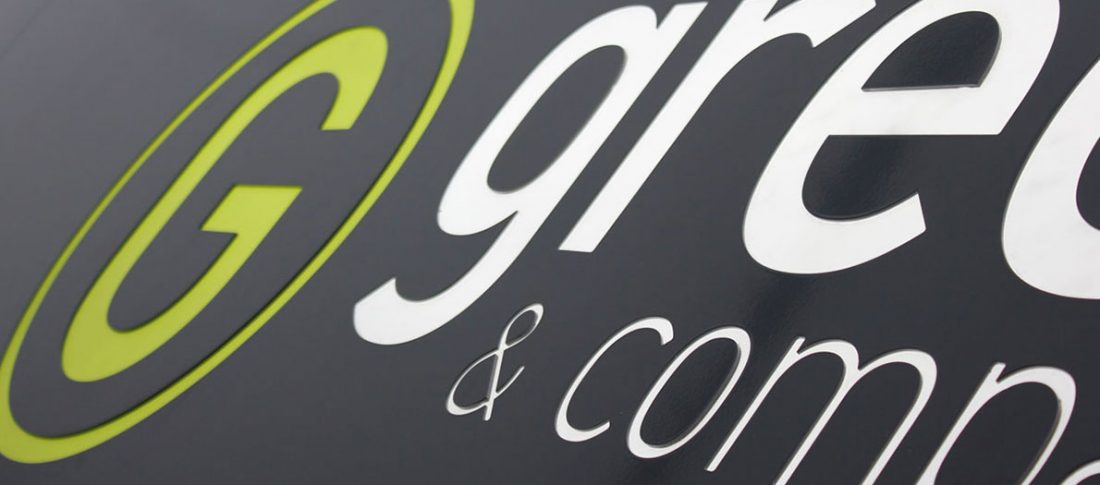
With a brief in place for the estate agent’s rebrand, we worked up a number of concepts which both met and challenged their initial ideas. It was agreed that formalising the company name to ‘Green & Company’ better suited their high-street offering, so we accompanied the refreshed name with a standalone G icon which would translate easily across online platforms, shop frontages and stationery.
And now?
Take a look at the end result, a real improvement don’t you think?
Here’s what Green & Company’s Director, Paul Ivens had to say about his Estate Agent’s Rebrand:
“Adventure Graphics listened to what we wanted from our rebrand process and were forthcoming with many different suggestions. They made multiple tweaks and changes to make sure we were completely satisfied and always responded quickly when we asked to see something new. Our new look is bold and noticeable ~ it has received fantastic feedback already.”
Paul Ivens – Green & Company’s Director


